YMCA Camp Moody

A basecamp for outdoor adventure and learning

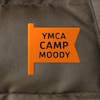
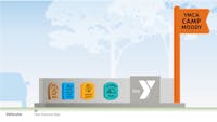
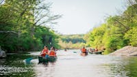
Tucked into a wide bend of Onion Creek south of Austin, YMCA Camp Moody is an 85-acre family adventure park that serves as a basecamp for outdoor activities and learning, within reach of all Central Texans.

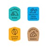
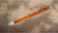
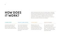
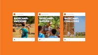
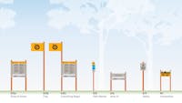
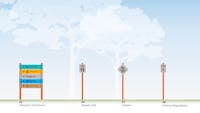
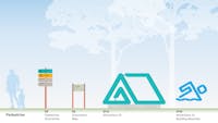
With a wide range of things to do — from camp classics like canoeing to the slightly unusual (atlatl, anyone?) — the YMCA needed a park brand and a strategy for packaging these a la carte experiences in an intuitive system.

The brand vocabulary and signage program were developed in tandem to ensure visitors understand the range of offerings and can easily navigate the park based on their interests.

Services

  • Naming
  • Brand Strategy
  • Branding and Identity
  • Message Architecture
  • Experiential Design
  • Signage and Wayfinding
  • Donor Recognition

Project Team

  • Chick Creative

Planting a flag

A bold orange flag — an iconic camp reference — represents the parent brand and provides a welcoming landmark at the entry gates.. The four core park experiences (camping, swimming, horseback riding, and field games) are differentiated by distinct names and badge shapes, colors, and icons, creating helpful trail markers across digital and physical contexts. The icon system also provides visitors and camp guides a universal reference for describing and purchasing access to the activities.

In the Y family

Though it abides by the national YMCA brand guidelines for color and typography, Camp Moody carves out its own space. A photography library provided by the local client team brings it all together in vivid color.

Position and messaging

Through a series of workshops with the client team, we defined a platform of messaging — tagline, headlines, elevator story, key messages, and campaign ideas — ensuring a consistent storyline and voice throughout media channels and fundraising pursuits.

1/9

Guided by symbols

Catering to a broad range of ages and their associated range of literacy, we developed an inclusive, icon-driven system to identify specific activities and areas of the park. The styling of the icons mimics those of the primary mark and the Y’s brand standard typography.

Happy trails

Within a sprawling site with fun activities around every winding corner, a comprehensive sign system provides simple orientation and navigation. A grand entrance presents the flag and badges in colorful, oversized forms that literally put the site on the map and introduce what lies ahead. Once inside the perimeter, durable signage confidently guides campers to their next adventure using activity icons and bright colors that are easy to spot in the natural environment.

1/4

I brought this project to Asterisk after having partnered with them on the rebrand of CapMetro during my tenure there. Their team’s ability to create brands with a focus on the experience of service and place for specific contexts and audiences — from public transit riders to adventure seekers — brought real value to our strategy and vision.

Brian Carter, CXO and COO, Greater Austin YMCA; former CXO of Capital Metro