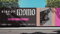
United Properties’ latest residential development is a vibrant addition to South Austin’s lively St. Elmo district. Inspired by the area’s unique character, Bishop Momo — a mischievous play on the neighborhood’s name — offers a celebration of dynamic urban living and provides an marked alternative to the tasteful greige standard of the industry.
Bishop Momo
Lighting St. Elmo’s fire

Services
- Naming
- Branding and Identity
- Message Architecture
- Experiential Design
- Signage and Wayfinding
Project Team
- Content & Context
- Belshaw Mulholland Architects
- TBG Partners
- Keaton Interiors
Everything in moderation. Including moderation.
The identity system pits fluorescent colors against black-and-white patterns for a joyful clash. Photography is cut up, remixed, and layered with type, pattern, and then more pattern.


South Austin in focus
The photography library reflects the eclectic character, color, and texture of the area.


Thunderbolt and lightning
A hot pink 14' neon lightning bolt puts Momo on the map. Father forgive us: the faces are made of the same metal used in confessional screens.


Signage on and throughout the property connects brand to space with an anti-establishment — but still code-compliant — vibe.

Tone down for what?
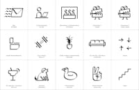
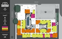
Momo’s cheeky personality influences every detail. Amenity spaces have irreverent nicknames and iconography, and unit plans are named with palindromes. (WOW!)
“Asterisk delivered more than branding marketing and signage for Bishop Momo. They translated our vision of this project into something that feels truly authentic and different than the rest of the market. Their ability to push beyond the conventional and expected has translated to tangible interest in our project and its success.”
Brenda Studt, Development Director, United Properties
Art al fresco
We commissioned local artist, Kevin Muñoz to create a vivid landscape abstraction that spans the 5-level garage façade.


Key Collaborators:
Kevin Muñoz