CapMetro

A transit brand for the future of Austin

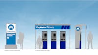
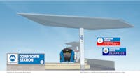
In November 2020, Austin voters approved a more than $7 billion investment in their local public transportation system. Dubbed Project Connect, the multi-year expansion will address ongoing regional growth by adding three light rail lines, a downtown subway, an expanded bus system, and more park-and-rides, as well as converting the system to an all-electric fleet. Together, these changes will help address the region’s need for connectivity, accessibility, equity, and sustainability.

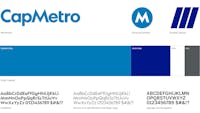
The executive team at the Capital Metropolitan Transportation Authority — locally known as CapMetro — asked us to update the system's legacy wordmark and visual brand standards. In response, we used local research, our team’s experience with public transit and complex wayfinding systems, and the extensive industry and audience knowledge of Sherry Matthews Group (CapMetro’s longtime agency of record) to create a new identity that positions CapMetro as a solidly reliable transit system critical to Austin’s growth and quality of life.

Renderings courtesy of CapMetro and the Austin Transit Partnership.

Services

  • Branding and Identity
  • Signage and Wayfinding

Project Team

  • Sherry Matthews Group
  • Austin Transit Partnership

Taking CapMetro beyond the Capitol

At the time of CapMetro’s last branding effort 15 years ago, Austin was principally known as the capital of Texas, and the old logo included the state capitol building. Now a global city known for tech, research, and culture, we were challenged by the CEO to solve for the CapMetro of 2040 with its larger service area and exploding local and international ridership.

With abundant research about local users and industry best practices, we quickly defined the need for a simple and universal language to connect the expanding service modes and allow for intuitive use. To build a shared understanding among the internal teams, the organization’s Board of Directors, and thousands of CapMetro employees, we developed, tested, and presented the work in an experience model based on a typical user journey.

Design for a universal experience

The experience model framework allowed us to define a seamless system for users from online trip planning through boarding, transfer of modes, and arrival, considering apps, digital tickets and fare cards, staff uniforms, station signage and wayfinding, ridership campaigns, and vehicle livery.

Establishing a strong foundation

The experience model clearly established the need for all CapMetro touchpoints to be easily identifiable as part of a single “metro” system, with an identity that stands out as that of a trusted civic entity.

We responded to this need by creating a logotype that is bold, distinctive, and immediately recognizable. By using Klim Type Foundry’s Geograph typeface (a modern version of the agency’s legacy Geometric 415), we prepared the brand for the future while maintaining a subtle connection to the agency’s long history of service to the city.

The new logotype conveys dependability and trustworthiness through its symmetrical construction around the central M. The M also serves as an easily identifiable mark for use on its own in wayfinding and facility identification, while honoring the batwing letter style that has long been central to the CapMetro brand. It works alone to simply and universally identify the system’s locations and services. Distinctive and describable, it serves as an effective landmark for use when giving directions or instructions on how to get around Austin using CapMetro.

By specifying a minimal color palette for the primary identity, we left plenty of room for the use of additional colors to delineate individual routes and lines as the system expands. Alongside the friendly bright blue we selected as the primary color, we added white, charcoal grey, and a second darker blue. This vibrant and electric secondary blue gives a bold, dynamic feel to one of the identity’s signature graphic devices, a set of three rising bars that suggests motion, energy, and growth.

1/3

Following the community’s historic decision to invest in public transit through Project Connect, CapMetro knew that its brand needed to be updated to reflect the modern agency it was becoming and the vibrant, diverse communities that it serves. The agency’s brand had a strong foundation, so Asterisk proposed that the rebranding should be more evolution than revolution. Their approach was inventive and collaborative, using data from customer surveys, industry peers, and staff interviews to guide their recommendations.

Brian Carter | Chief Experience Officer, CapMetro

For Austinites, the CapMetro brand is concise, reliable, and dynamic, adapting to the needs of a quickly-changing city. For visitors, the system is easily understood as a public transportation utility, on par with other metro brands around the world.

1/2

“Heading downtown to the convention center? You’ll want to take CapMetro. Look for the blue M as you exit the airport and board the Blueline train.”

Asterisk took on the challenge with thoughtful strategy based in real user experiences, and their team made the process delightful. The result of their work is an elegant suite of design components that will allow CapMetro to modernize its brand over time as new capital investments are made.

Brian Carter, Chief Experience Officer, CapMetro

CapMetro’s in-house design team is now developing and implementing the program as budgets allow and equipment updates demand.