Ballantyne

Building the vision for a Charlotte destination

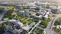
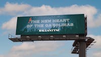
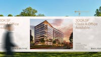
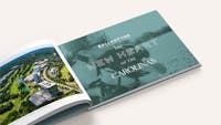
Ballantyne has been an established commercial real estate hub in Charlotte, North Carolina, since its initial development in the 1990s. With four million square feet of office space, thousands of apartments, and a 600-room hotel spread across more than 500 acres of rolling hills, Ballantyne has long been Charlotte’s preferred home for some of the world’s most prestigious companies.

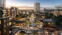
Motivated by the region’s explosive growth, longtime client Northwood is taking Ballantyne to another level, implementing an ambitious master plan that reimagines Ballantyne as a walkable, 18-hour mixed-use neighborhood focused on culture, community, and sustainability.

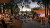
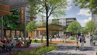
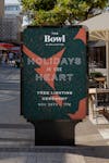
Northwood turned to us to revamp Ballantyne’s visual identity while also shaping a vision for The Bowl, the area’s new retail destination.

Services

  • Brand Strategy
  • Branding and Identity
  • Marketing Collateral and Campaigns
1/4

Creating an inclusive foundation

The legacy Ballantyne identity was rooted in the 1990s, utilizing the calligraphic typography and dark colors typical of the era’s suburban corporate parks.

Through site visits and discussions with Northwood’s in-house marketing and design teams, we built an understanding of the local context, the region’s growing population, and the development team’s long-term vision for the project.

The new Ballantyne wordmark reflects this new mixed-use vision with timeless typography that’s both bold and elegant, equally at home representing the project’s commercial, retail, entertainment, and residential components

A vocabulary as eclectic as the place

A family of geometric illustrations reflect Ballantyne’s amenities and its emphasis on open spaces and healthy lifestyles. Used as colorful patterns or in energetic animations, these components act as a playful foil to the timeless wordmark.

A flexible B monogram steps in for the wordmark in environmental, digital, and printed applications where the full name is unnecessary or unwieldy.

The state bird of North Carolina, a stylized cardinal symbolizes Ballantyne’s connection to nature and its commitment to sustainability. This proudly modern bird can be found perched on headlines, living in the corner of printed or digital communications, or serving as a source of discovery and delight in environmental applications throughout the community.

A destination within

The Bowl is a dynamic entertainment, retail, and food-and-beverage hub — Including a 2,000-person amphitheater — within the larger Ballantyne community

We created a distinctive sub-brand for The Bowl with its own logotype and visual vocabulary, including a flexible system of “cut paper” shapes inspired by music, shopping, and the area’s natural environment.

1/2

Project renderings by Design Distill